

Overcrowded Interfaces - When Less is More
Understand the dangers of cluttered design and how simplicity can enhance user experience.
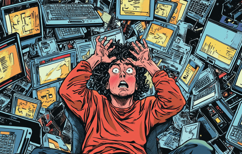
In today’s digital circus, where every screen is shouting for your attention, you’d think we’d have learned to keep things simple. But nope. Most of you are out here stuffing your user interfaces (UI) like it’s a turkey on Thanksgiving. Newsflash: adding more stuff doesn’t make it better.
This article is here to school you on why your cluttered designs suck and how embracing the “less is more” mantra could save your digital products from drowning in their own chaos. We’ll show you how to cut the fluff, make navigation bearable, and find that elusive balance between doing too little and doing way too much.
Key Takeaways
- Overcrowded interfaces are a one-way ticket to frustrated users and terrible engagement.
- Minimalist design is your friend—if only you’d stop ignoring it.
- Cutting out the unnecessary clutter is the first step to saving your UI from itself.
- Balancing functionality with simplicity is the key to not making people hate your product.
- Spoiler alert: people’s brains love simplicity. Maybe you should consider that.
Understanding the Impact of Cluttered User Interfaces
Do you enjoy making your users suffer? Because overcrowded UIs are basically the digital equivalent of torture. Shoving too much junk into your interface overwhelms users, making them wonder why they even bothered with your product in the first place.
Why Overcrowded UIs Make People Hate Your Product
When you cram too much crap into your UI, you create cognitive overload—fancy talk for “too much stuff makes my brain hurt.” Without a clear visual hierarchy, users are left stumbling around, confused and frustrated, until they inevitably give up and go find something better. Well done.
The Importance of Visual Hierarchy and Clarity
Visual hierarchy isn’t just some design buzzword; it’s the difference between a usable product and a dumpster fire. If users can’t figure out where to go or what’s important, they’re not going to stick around. So, instead of overwhelming them with a million options, maybe try organizing things for once?
By keeping things clear and stripping down the excess clutter, you make your product not just tolerable, but maybe even good. Shocking, right?
The Principles of Minimalist Design
Minimalist design is for people who understand that less really can be more. Instead of throwing everything at the wall to see what sticks, you actually have to think about what matters. Scary thought, huh?
Focused Functionality
Pick the features that actually matter. Stop pretending your users care about every tiny thing you’ve crammed into the interface.
Negative Space
Learn to love the emptiness. Negative space, or whitespace, is your best friend in helping people actually see what’s important. Or, you know, you can keep cramming in content until no one knows where to look.
Visual Clarity
If your users can’t figure out what’s going on in your interface at a glance, congratulations, you’ve failed.
Identifying Unnecessary Elements and Clutter

Let’s play a game: look at your interface and ask yourself, “Do people actually need this?” Spoiler: the answer is probably no.
Streamlining Navigation and Menus
Your navigation is a mess. There, I said it. Too many options, too many layers, and no one knows where anything is. Time to simplify. Audit your navigation structure and trim the fat—your users will thank you.
| Before Decluttering | After Decluttering |
|---|---|
| Messy dropdown menus galore | Simple, focused navigation |
| Disorganized menu structure | Clearly defined and useful options |
| UI clutter everywhere | Clean, uncluttered design |
Balancing Functionality and Simplicity
Here’s a novel idea: maybe your interface can be both functional and simple. You don’t need to sacrifice one for the other. The secret is in figuring out what people actually need and not overwhelming them with junk.
Enhancing Usability with Negative Space
Negative space isn’t just “empty space.” It’s the best tool you’re not using. It guides the user’s eyes, makes your content readable, and gives your design a sense of balance that your cluttered mess could never dream of achieving.
The Art of Whitespace in UI Design
Whitespace helps users focus on what matters. It gives your UI breathing room, so people can actually use it without getting overwhelmed by all the noise. But hey, keep ignoring it if you love users abandoning your product.
Case Studies: Successful Decluttered Interfaces
Want proof that clean design works? Look no further than these examples:
- Amazon: Despite selling literally everything, Amazon keeps its interface simple. Users can actually find what they’re looking for. Imagine that.
- Apple’s iPhone: People love it because it’s easy to use, not because it’s packed with features no one asked for.
- Todoist: This task management app doesn’t drown you in options. It’s simple, focused, and people love it for that.
Minimalism in Mobile App Design
If there’s one place you should stop overloading with junk, it’s mobile apps. People have tiny screens and even tinier attention spans. Don’t waste it by cramming in every feature under the sun.
Overcoming Small Screen Challenges
Design for small screens by focusing on the essentials. Strip it down to what’s really important and hide the rest. If users can’t figure out how to use your app in five seconds, they’ll delete it faster than you can say “clutter.”
Decluttering for Improved Accessibility
Decluttering your UI isn’t just good practice; it makes your product accessible to more people. You know, like people with visual or cognitive impairments, who don’t want to deal with your messy, confusing interface.
| Benefit | Description |
|---|---|
| Reduced Cognitive Load | Decluttered interfaces help people focus and prevent mental breakdowns caused by too much info. |
| Enhanced Readability | A clean design with whitespace is easier on the eyes. Go figure. |
| Improved Navigation | Streamlined menus actually help people find things. Shocking, I know. |
| Inclusive Design | Decluttering your UI makes it usable for everyone, not just people with endless patience. |
The Psychology of Simplicity and Cognitive Load
Ever wonder why some UIs are easy to use and others make you want to throw your device across the room? It’s all about cognitive load. Your brain prefers simplicity, and so do your users. Minimalist design keeps things clear and easy to process, which makes people actually want to use your product.
FAQ (Because You Clearly Need Help)
What’s the importance of minimalist design? It makes your UI less of a hot mess. Clean design keeps people happy. Try it sometime.
How can I identify unnecessary elements in my UI? Look at your interface and ask yourself, “Does anyone really need this?” The answer is probably no.
What are the key principles of minimalist design? Less junk, more whitespace, and focusing on what matters. You know, common sense.
How do I balance functionality and simplicity? Stop adding pointless features and focus on what your users actually need.
How does negative space improve usability? It gives your design breathing room. Without it, your interface looks like a junkyard.