
Typography Terrors - The Fonts That Are Killing Your Readability
Discover how poor font choices can undermine your design and make your content a chore to read.
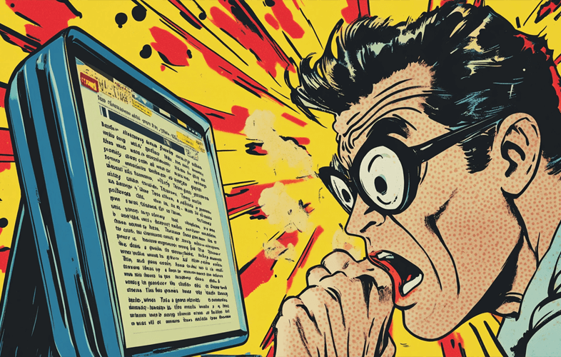
In the digital world, typography is apparently important, or so designers like to believe. But let’s be real—many designers and writers make font choices that not only assault the eyes but are also borderline war crimes against readability. In this piece of literary art, we’ll show you the fonts that are basically plotting against your message. You’re welcome in advance. Oh, and we’ll throw in some tips, because obviously, you need help.
Key Takeaways
Because Reading Is Hard
- Discover the fonts you should definitely stop using before they ruin more lives.
- Understand why good typography matters (yes, it actually does).
- Learn to identify those nightmare-inducing fonts and make better choices.
- Explore how to create contrast, hierarchy, and consistency—concepts you’ve likely heard but clearly don’t grasp yet.
- Figure out how to make typography readable on mobile, because yes, people read on tiny screens too.
What Is Typography and Why Should You Care?
Typography is the “art” of arranging text so it’s not a complete disaster. Sure, the right fonts can make you look like you know what you’re doing, but based on what’s out there, this seems like a long shot. The truth is, good typography can make people believe your message doesn’t suck. But hey, don’t worry—if you’ve been using Comic Sans, you’re already doing irreparable damage to your brand.
The Anatomy of a Readable Font
As If You Even Knew…
To truly appreciate the cluster of bad choices you’ve made, let’s dive into the anatomy of readable fonts. That’s right—your beloved fonts have traits, like x-height, kerning, and stroke width. Don’t worry, I’ll explain those for you since clearly, you didn’t bother to Google them. Fonts with a nice x-height are more readable because, shocker, people can actually tell what the letters are. Kerning? Yeah, that’s the space between characters that you didn’t notice until it became too late. And stroke width? That’s the part that makes fonts look like fonts and not crayon drawings.
TL;DR: Learn this stuff, or continue to live in your font oblivion.
Identifying Problematic Typefaces
Or Just Go Ahead and Sabotage Yourself…
Some fonts are so bad that they deserve to be locked away in a digital dungeon. They’re either too thin, too decorative, or just a full-blown eyesore. But don’t let that stop you from using them in your next project! Go ahead—pick the unreadable, amateur font that screams “I gave up on life.”
The Impact of Poor Font Choice on User Experience
Spoiler Alert: It’s All Bad…
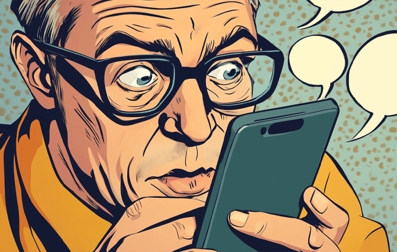
Selecting a bad font isn’t just a minor hiccup; it’s a full-on user experience disaster. Fonts that make your readers squint or break out in hives do more than irritate—they actively repel. But hey, if your goal is to drive people away, by all means, keep using that tiny, illegible font on your website.
Accessibility Alert: People with vision issues won’t be able to engage with your content, but who needs an audience, right?
Common Typography Blunders You’re Probably Making
Oh, the mistakes. Where do we begin? How about using every font on your computer just because you can? Or choosing fonts that make your brand look like it belongs in a preschool craft project? Let’s not forget the ever-popular mistake of picking colors that blend into the background. Bravo. You’ve made your message impossible to read, and that’s one way to keep people from noticing your bad design.
Contrast and Hierarchy: The Concepts You’ve Been Ignoring
Contrast and hierarchy are words you’ve heard but clearly misunderstood. If your content looks like a blob of same-sized, same-colored text, congratulations! You’ve failed. You need contrast to make things stand out, but not so much that it blinds people. Maybe give hierarchy a try—you know, organizing your text so it’s not a chaotic mess.
Pro Tip: Stop treating bold and italics like they’re the last two spices on earth.
Responsive Typography for Mobile Devices
Because, Surprise! Mobile Exists!
Oh, you didn’t consider that people might read your masterpiece on their phones? How quaint. Responsive typography isn’t optional—it’s necessary if you want to avoid being the butt of jokes in the design community. Maybe spend five minutes adjusting font sizes and spacing so your text doesn’t look like it’s been squeezed through a straw.
Pairing Fonts: You’re Doing It Wrong
You’ve been picking fonts like a kid chooses candy—grab whatever looks shiny and throw it together. No. Just stop. There’s an actual art to pairing fonts, and it’s not as simple as mixing random ones because they “look cool.” Please, for the love of all that’s legible, try to find fonts that complement each other instead of clashing like a bad family reunion.
Free and Premium Font Resources
Because Clearly, You Need Them
If you’ve made it this far, congratulations. You now know that your font choices are horrifying. So, let’s steer you toward some resources to fix the carnage. Free fonts exist, but don’t let that tempt you into using a Comic Sans knockoff. And if you’re feeling fancy, there are premium fonts out there that might actually save your design from itself.
- Google Fonts: Free, but please pick wisely.
- Font Squirrel: Free, but again, choose like a grown-up.
- Adobe Fonts: Premium, because maybe it’s time to invest in fonts that don’t scream “amateur hour.”
Conclusion
If you’ve read this far and haven’t rushed to change your fonts, I commend your bravery. Typography is more than slapping letters on a page. It’s about not making people suffer while they try to read your content. Fix your fonts, learn how to pair them, and maybe—just maybe—people will actually stick around to see what you have to say.