
Use Faces to Cleverly Direct People to Your Important Content
Learn the sneaky art of using faces to guide users to your content. Because why rely on good design when a strategically placed stare can lead users right to your CTA? Discover how eye-tracking and gaze direction can do the work for you—if subtlety isn’t your strong suit.
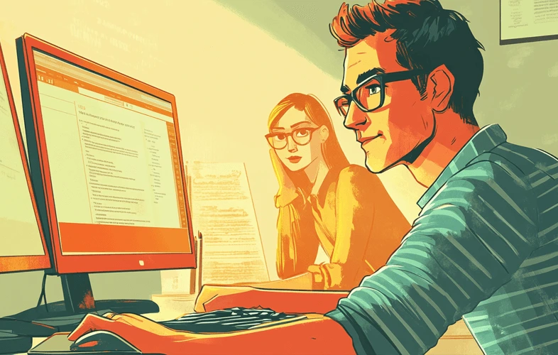
Have you ever noticed how your eyes are drawn to faces in photos? Shocking, right? Well, buckle up, because apparently, this basic human instinct is now the hottest trick in web design. By strategically plopping faces around your site, you can nudge visitors toward key content like a hypnotist guiding a crowd. Who knew guiding users could be as simple as getting someone to look at a button?
The Magic of Faces
Because Your Content Clearly Isn’t Compelling Enough..
It turns out that faces are so distracting that people can’t help but follow their gaze. So, instead of making your content actually interesting or clear, you can rely on a pair of staring eyes to do the heavy lifting. By strategically placing faces that “look” at important sections of your site, you can magically boost engagement because, apparently, subtlety is overrated.
The “Science” Behind Facial Attraction
Because Just Being Clear Would Be Too Easy!
Our brains are wired to recognize faces faster than anything else. This instinct, probably meant for spotting friends or foes in the wild, is now being hijacked to direct people’s attention on websites. Forget clever design or engaging content—just throw in a face and watch the magic happen.
Evolutionary Psychology in Design
Because Apparently We’re Cavemen…
Thanks to evolutionary psychology, we’ve developed a natural radar for faces. Instead of using this information for survival, designers now leverage it to subtly (or not so subtly) point out the “important” parts of a website. So, while our ancestors used face recognition to avoid getting eaten, we’re using it to make sure users see a CTA button.
The Power of Gaze Direction
As If Users Wouldn’t Notice Your Content Otherwise.
Want people to see a specific piece of content? Just make sure your strategically placed face is looking right at it. This technique, though simple, is like a digital cattle prod guiding users exactly where you want them to go. Remember, who needs actual usability when you can just “suggest” it with a person’s gaze?
Pro Tips for Optimal Gaze Exploitation
- Place faces near critical information: Because apparently, users are too distracted to find it without a visual cue.
- Align gaze with desired user path: Nothing like some hardcore eye manipulation to get users to follow your breadcrumbs.
- Use expressions that match your content’s tone: A serious face for serious content, a smirk for playful stuff. Subtle as a hammer.
Best Practices for Using Faces in Design
Using faces in design can make your site more engaging because, apparently, your content on its own just isn’t cutting it. Here’s how to leverage faces effectively without totally insulting users’ intelligence:
1. Choose High-Quality, “Fitting” Images
Don’t just grab any stock photo with a face. Make sure it’s on-brand and “authentic.” Because if there’s anything worse than this trick, it’s using it with a face that looks like it belongs in a toothpaste ad.
2. Position Faces to Guide Focus (Yes, Really)
Want users to click a button? Position a face to look straight at it. It’s not subtle, but hey, it works. Nothing like a human head to remind users where they should be looking.
3. Moderation Is Key (Believe It or Not)
Yes, faces grab attention, but using too many will make your site look like a creepy photo album. Balance is everything, so maybe just one or two staring eyes will do. Too many, and you might accidentally start looking like a horror movie poster.
The Consequences of Overusing Faces
AKA - When Manipulation Backfires.
Let’s be honest: throw too many faces into your design, and users are going to notice the manipulation. It’ll become obvious that your content isn’t compelling enough on its own. So, if you don’t want users to feel like they’re being tricked, keep the face trick to a minimum. After all, the last thing you want is for users to realize you’ve been blatantly leading them around by the eyes.
At the end of the day, using faces to direct attention is a gimmick—a sneaky, effective gimmick, but a gimmick nonetheless. Instead of relying on quality design and useful content, faces give you the shortcut to engagement. So go ahead, use this little trick, but don’t be surprised when users start catching on. Because nothing says “we didn’t trust our content to speak for itself” quite like a face strategically pointing out what’s “important.”